Brand Marks
As a key part of a company’s visual identity, brand marks are often the first thing you see and what you remember the most. When used correctly, they become instantly recognizable. Think McDonald’s golden arches or the Nike swoosh.
To build awareness and recognition of our brand, use the guidelines below for effective and consistent presentation.
Logo
The Essendant logo is our primary branding device. It’s the most recognizable for customers and associates.
Please refer to the brand colors section of this guide for more in-depth information on color.
Please refer to the brand colors section of this guide for more in-depth information on color.
Do present the logo on its own - no tagline.
Don’t distort the logo by stretching or compressing it.
Don’t change the colors of the logo.
Logo Spacing
The proper placement of the logo from surrounding elements ensures that our brand mark is clearly visible and distinguishable.
Do place logo so that it has the equivalent of a ‘pinnacle’ of space from surrounding items or edges.
Don’t place the logo too close to other elements or the edge.
Logo Alternates
To maintain legibility and our branding, use these alternatives.
Reversed Out - For use on dark colors.
Black and White - For use in grayscale printing.
Pinnacle
The pinnacle is an important element of our branding. As we work to build brand awareness, it’s important to present the pinnacle in the context of the Essendant logo. This connection will help reinforce the association of the pinnacle to the Essendant name.
In the rare instances that the pinnacle is used on its own, follow these guidelines.
In the rare instances that the pinnacle is used on its own, follow these guidelines.
Do provide ample space for the pinnacle to stand on its own when displaying it.
Don’t stretch, squash, rotate or distort the pinnacle in any manner.
Pinnacle as a Background Element
Occasionally, we use the pinnacle in PowerPoint presentations, emails, trade show exhibits and more as a powerful design element.
Do use the pinnacle as a stand-alone element tastefully and sparingly.

Don’t rotate the pinnacle, use it as an “A” (except for the approved usage in our logo) or an arrow, combine it with other graphics, or use it as a repeating pattern.

Pinnacle as an End Page Element
Our logomark may be used as a way to end a video or PowerPoint presentation, since it follows information that establishes the Essendant brand.
Do use the pinnacle at the conclusion of a presentation.

Don’t begin a presentation with a pinnacle or pair it with unapproved language.

Co-branding
Occasionally, we team up with other brands for projects, trade shows, etc. Here are some rules to follow when creating co-branded logo lockups.
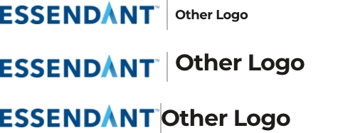
Do create a balanced lockup that allows enough space for each logo to breathe and stand on its own. We prefer to display logos inline, but if not possible, use a stacked format.

Don’t design lockups where logos are out of scale, unbalanced or too close.
