Brand Colors
From projecting personality to evoking emotion, color plays a crucial role in a successful brand strategy. Our brand colors create harmony, balance and cohesion, and convey trustworthiness and strength. As a vital part of our visual identity, consistent and proper use is important.
Main Colors
The Essendant color scheme consists of two main blue colors - a strong dark blue and a light vibrant blue.
Essendant Dark Blue
PMS : 301C HEX : #004b87 RGB : 00 : 75 : 135 CMYK : 100 : 52 : 04 : 19
Essendant Light Blue
PMS : 298C HEX : #41b6e6 RGB : 65 : 182 : 230 CMYK : 67 : 02 : 00 : 00
Supplementary Colors
These three tones are used to create balance in our color scheme. The white and grays compliment our blues and ensure that we are not implementing a lopsided color scheme.
White
PMS : 000C HEX : #ffffff RGB : 255 : 255 : 255 CMYK : 00 : 00 : 00 : 00
Light Gray
PMS : Cool Gray 1C HEX : #eeeeee RGB : 238 : 238 : 238 CMYK : 05 : 04 : 04 : 00
Dark Gray
PMS : 440C HEX : #333333 RGB : 51 : 51 : 51 CMYK : 69 : 63 : 62 : 58
Gradient
When using our main colors to create a gradient, maintain a 50/50 ratio between the two. And only apply a gradient in design opportunities that allow it to subtly reference the gradient found in the Essendant pinnacle.
Do create a smooth, balanced and linear gradient.


Don’t use an unbalanced or circular treatment.


Color Usage
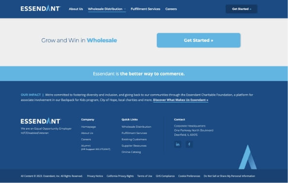
Referencing these screenshots from essendant.com, you can see our color strategy in play throughout the typography and layout elements.
The dark blue is our primary and most used color due to its dark hue, making it an ideal background color in layout elements.

When used together in type, the light blue acts as a highlight within the dark blue.
The light blue compliments the dark blue as an eye-catching accent color.

Secondary colors like the light gray and white are used as alternative background colors within layouts.